UX Prototypes in EdTech
Various UX Designs and wireframes for products like TDX, Short Courses, MyDietAnalysis, Smart Sparrow.
Project Details / Background
TDX
As a User Experience Designer, I worked on various products, like Revel, MediaShare, MyVirtualChild, Learning Catalytics, TDX, MyLabs, Mastering, MyDietAnalysis, Short Courses, SmartSparrow, and more. I was on the team that worked on TDX, which was an application that focused on Complex Math and Accounting assessments. One of the team's goals was to redesign the legacy desktop application into a mobile application. This included the “keyboard editor” which allowed Learners to enter variables and symbols based on the type of math they were trying to solve. This was a successful product because of the reviews from Math students in Undergraduate and Graduate level courses. In addition, this widget was re-used in Pearson’s Aida app, which uses Ai to solve math problems by showing each step of the derivative. In addition, we created a mobile and interactive graphing application and a complex table assessment.Short Courses
In 2019, I worked on several personas for a product called Short Courses, which would be sponsored by employers. After reading a Business Intelligence deck of 150 slides, I created 5 personas that were used in a design workshop in the United Kingdom. We came up with an HTML/CSS/D3 prototype, where the Lifelong Learner would take a skills diagnostic or "What color is my parachute?" type of survey. Based on the Users' results and data shared by LinkedIn, the application would display a spider graph based on skills that the User would share with our Members in their networks, and other visualizations with a modules map and courses. The spider graph was interactive and dynamic. There was even an Office Hours VideoChat platform that our group came up with in a brainstorm. The project was eventually shut down, but the "Office Hours" feature was transported to two other projects. As a coding exercise, I often revisit this idea by playing with tags in LinkedIn and learning to code in Python, to see if I can "scrape" the data, and revisit my experimenting with the D3 framework, but I'm a long way away.Giphy Tutor (High-Level)
Following the Aida app, I worked on Giphy Tutor, a microsite that allows a Learner to search for a gif-animation of a math formula. They would be able to filter formulas according to the discipline of math: algebra, geometry, trigonometry, calculus, differential equations, etc. When a Learner searches for a desired theorem, the Learner would be able to click into that specific formula and view the animation, speed up or slow down the animation, or pause the animation and tab through each frame using the dot-pagination.Barcode Scanner using HTML5 Mobile Browser and MyDietAnalysis visualizations and microcharts using D3
In 2019, I had been working on accessible prototypes for a product called MyDietAnalysis, a product to help Instructors and Learners track nutritional information. The Senior Designer of the project had asked me to look into accessing mobile cameras using HTML5 for a future feature that would allow Learners to scan UPC barcodes from food packages to add to their Nutrition Record. There are many apps out there that scan barcodes, but mostly iOS and Android operating systems. This exploration would open this feature to Users who navigate sites via mobile browsers "responsively." As a first step, I searched for several tutorials on how to access the camera using HTML5 and found several tutorials. This demo worked on my iPhone 6S at the time.I was able to research several open source API's that already had this parameter in their database and pass that information onto third-party developers (ie USDA). In addition to making this redesign accessible by code and ARIA attributes, we also worked on D3 information graphics that were also a11y -- complex bar charts that were rendered in XS, S, M, L, XL screens as well as several donut charts.Braille Equation Editor
In 2016-2017, I worked on the TDX Equation Editor. TDX was an assessment engine and as the UX Designer, I worked on the equation editor where keys were sorted according to math disciplines. In 2020, the repository was transferred to our group, however it was put on hold. I did, in the interim study how Blind Learners use math technologies online, including Desmos sonic graphs and checked out the markup for MathJax, a JavaScript framework that displays mathematical notations using MathML, LaTeX, and ASCIIMathML. I was really inspired because one of my projects that I prototyped in grad school was a braille ring using pins because NYU's ITP program had a track for Assistive Technology Course. To this day, I still read up on Professor Hiroshi Ishii's Physical Telepresence of MIT MediaLab and Professor Danny Rozin's Wooden Mirror of NYU ITP.Interactive CheatSheets (High-Level)
Interactive CheatSheets was a concept when a colleague asked for ideas about projects for Chemistry. Having worked on Mastering, XL, MyLab, TDX (ie Pearson products that cover STEM and Assessments) and having been an engineering student a couple of times, I found cheatSheets to be of use. The idea of Interactive CheatSheets would start as a blank dashboard where the Learner can personalize, mix and match components of several cheat sheets to combine into one. For instance, if I were to take an Organic Chemistry course, maybe I would need a 2-D model and or 3-D model of a formula (ie the Learner would be able to toggle between the two models at a click of a button). Or maybe, my course would require different disciplines of science, such as "General Chemistry," "Biochemistry," and "Biophysics" — I would be able to mix and match bits and bytes of components or drag and drop to reorder the hierarchy of information (ie personalized).Image Gallery
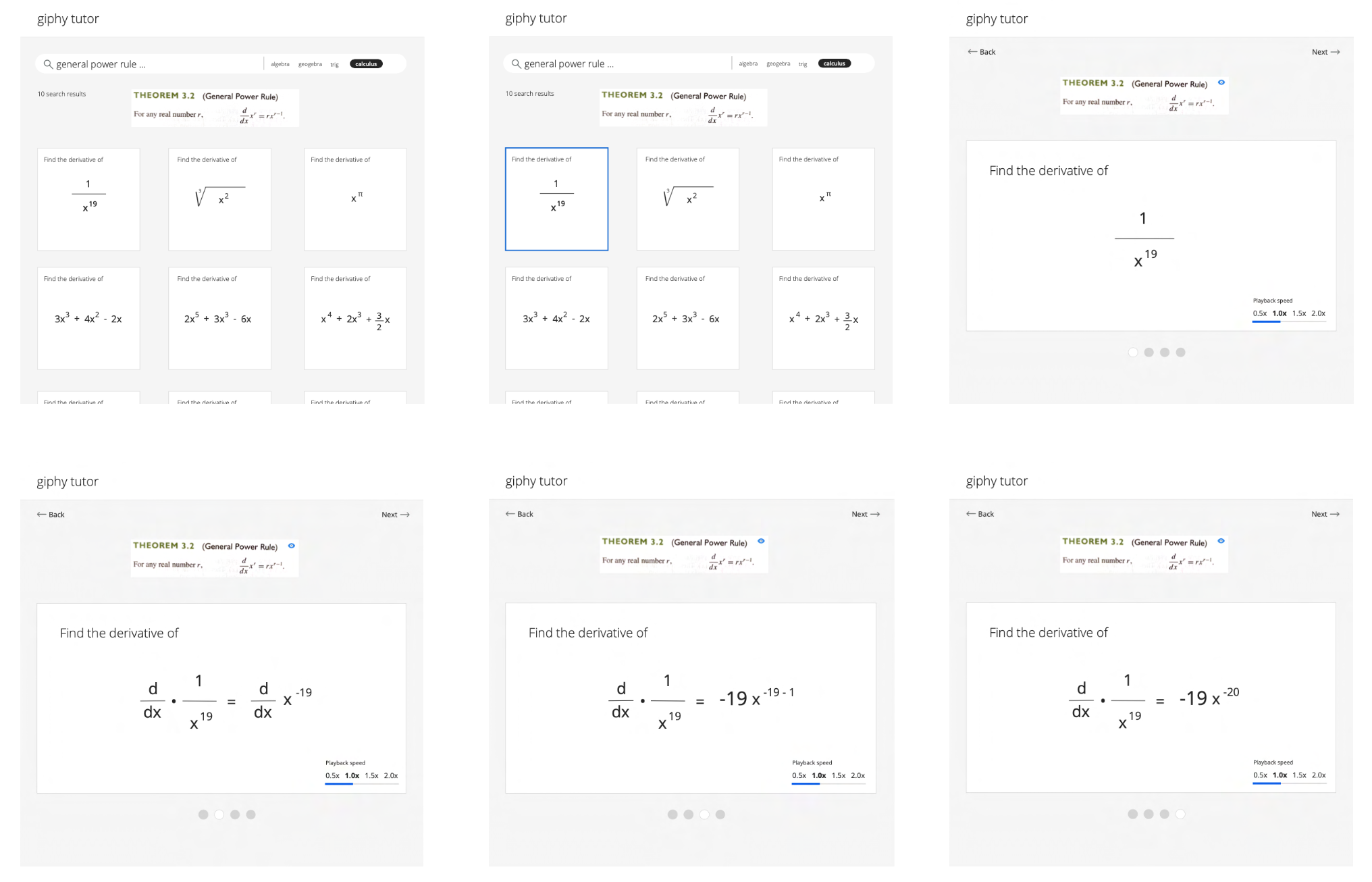 GiphyTutor interface.
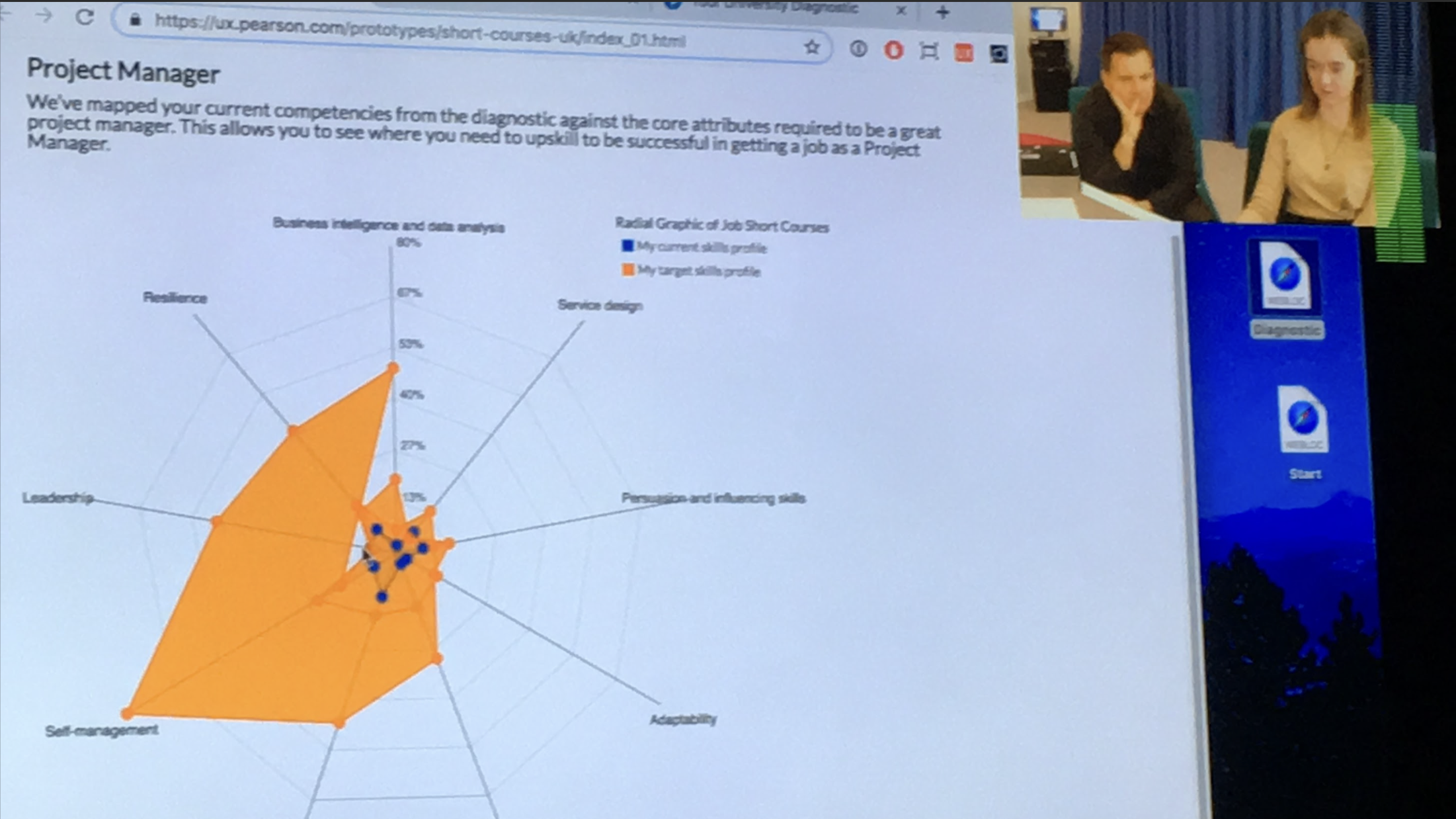 Short Courses User Testing session with interactive prototype of radial graph on skills following survey.
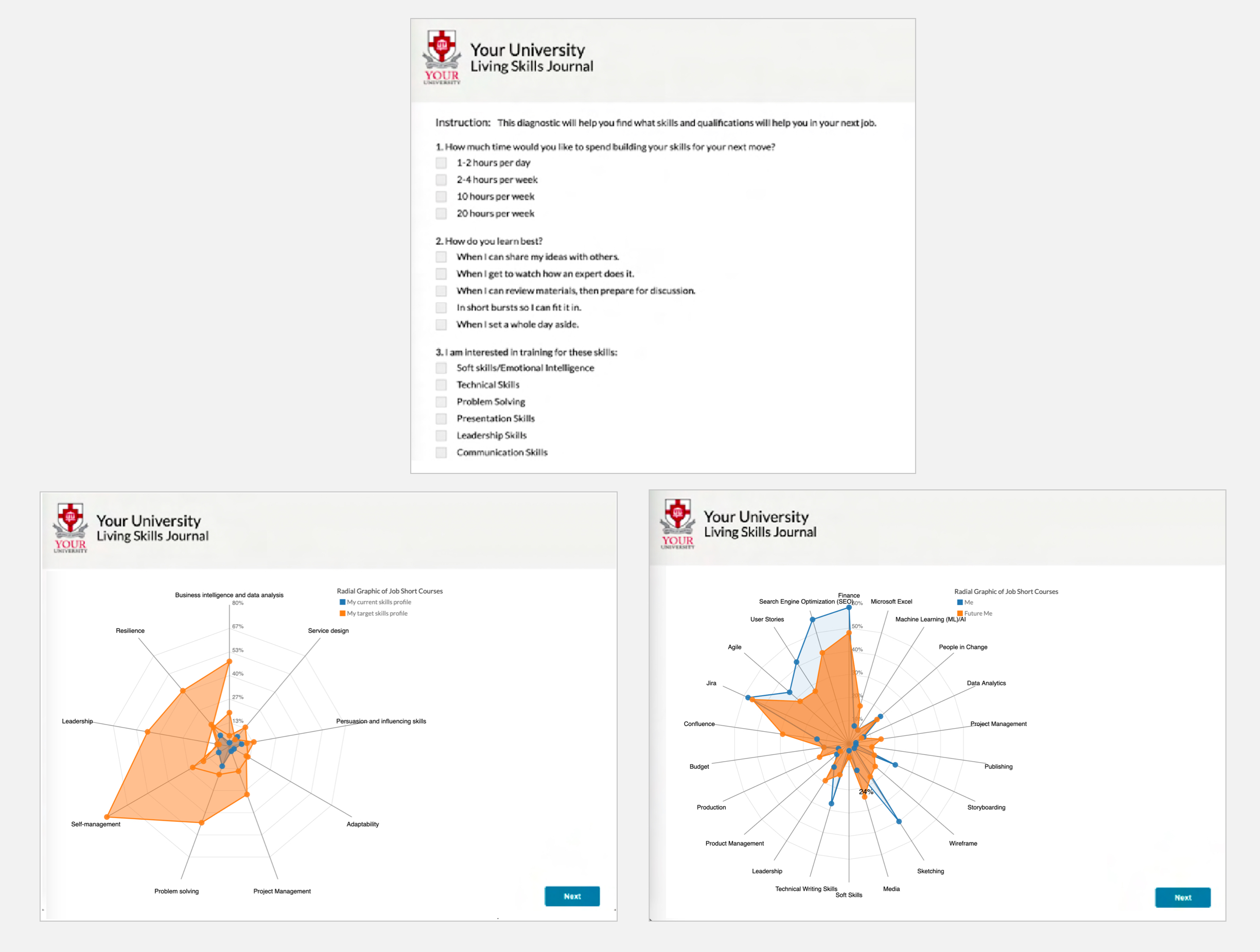 Short Courses Survey that displays radial graph to show "current skills" versus "skills to attain."
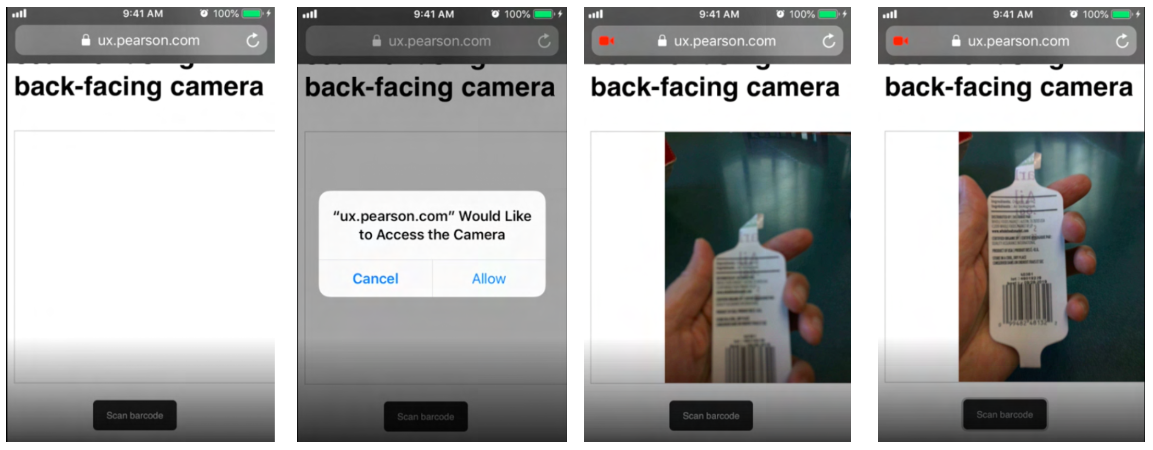 Barcode scanner code working responsively on mobile device without the need to use an operating system like iOS.
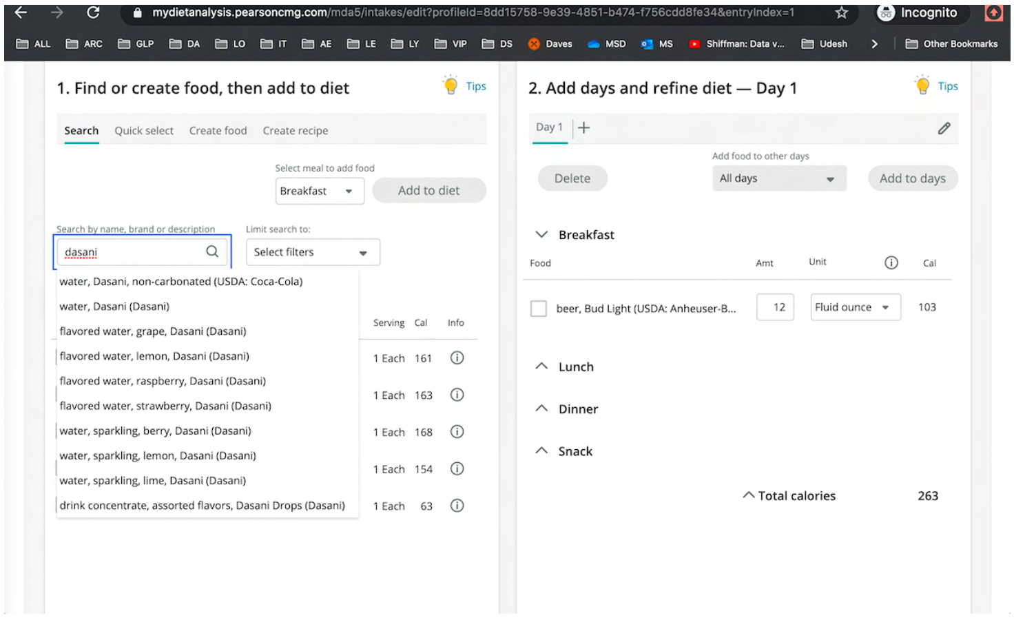 Coded the MyDietAnalysis so that the data would refresh to show real-time data.
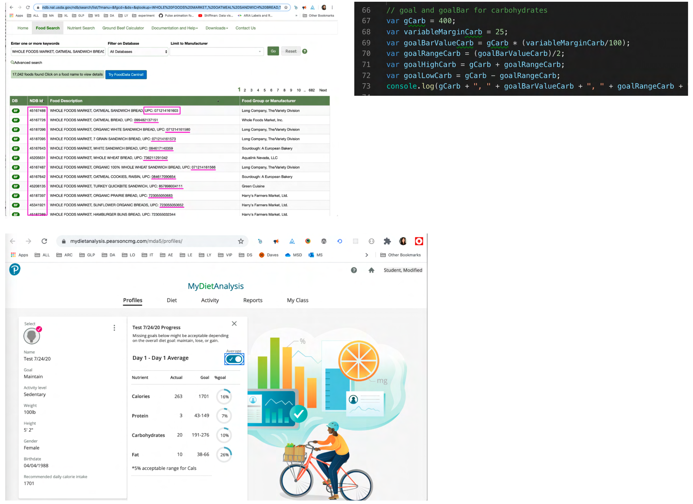 MyDietAnalysis User Interface.
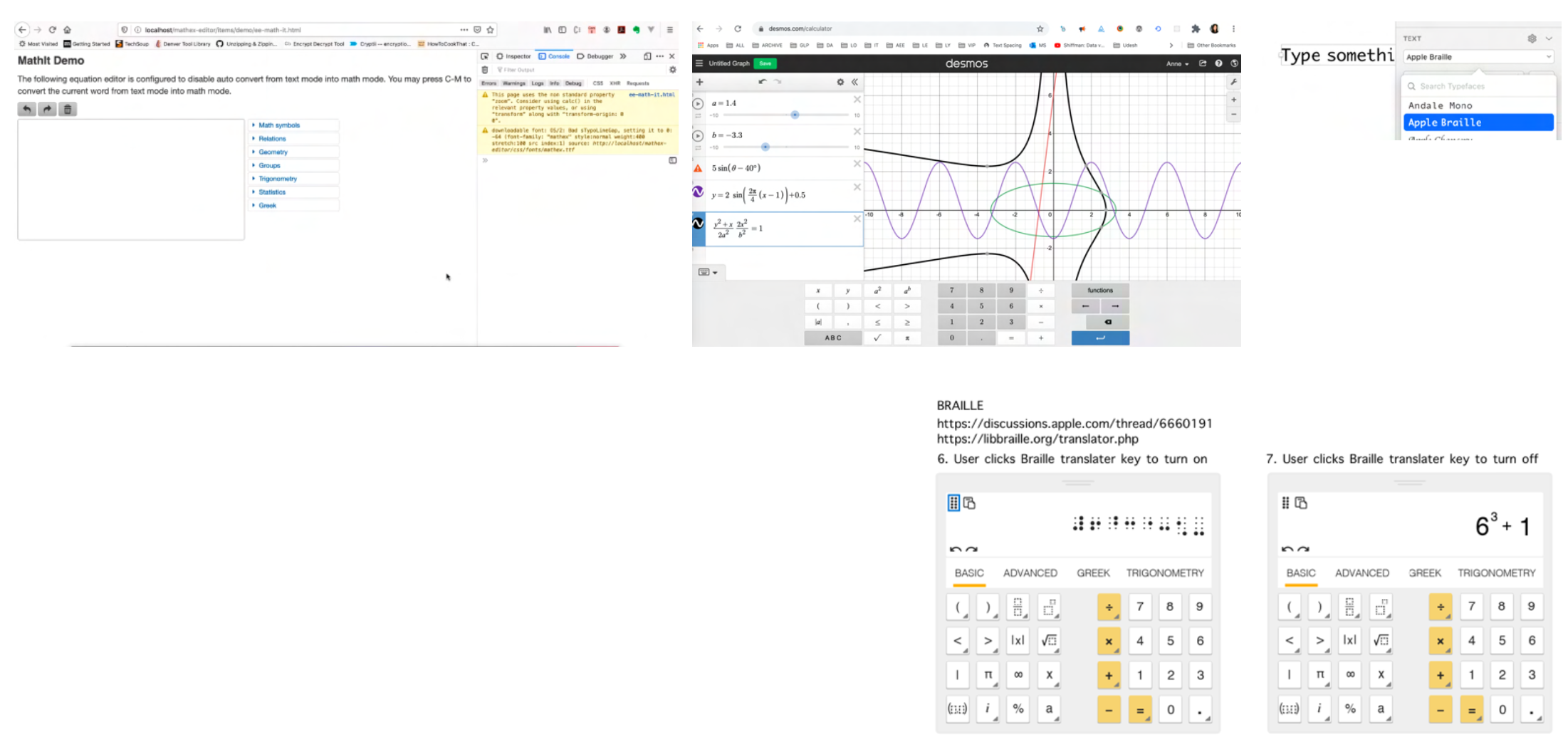
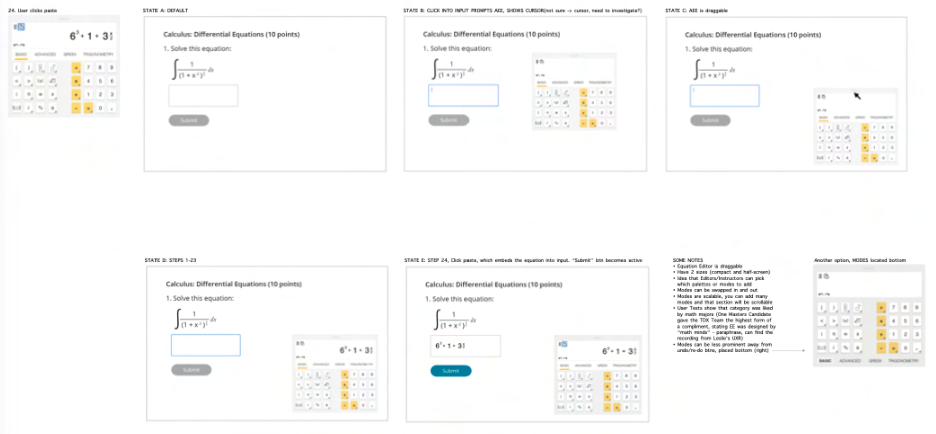 Braille Equation Editor.
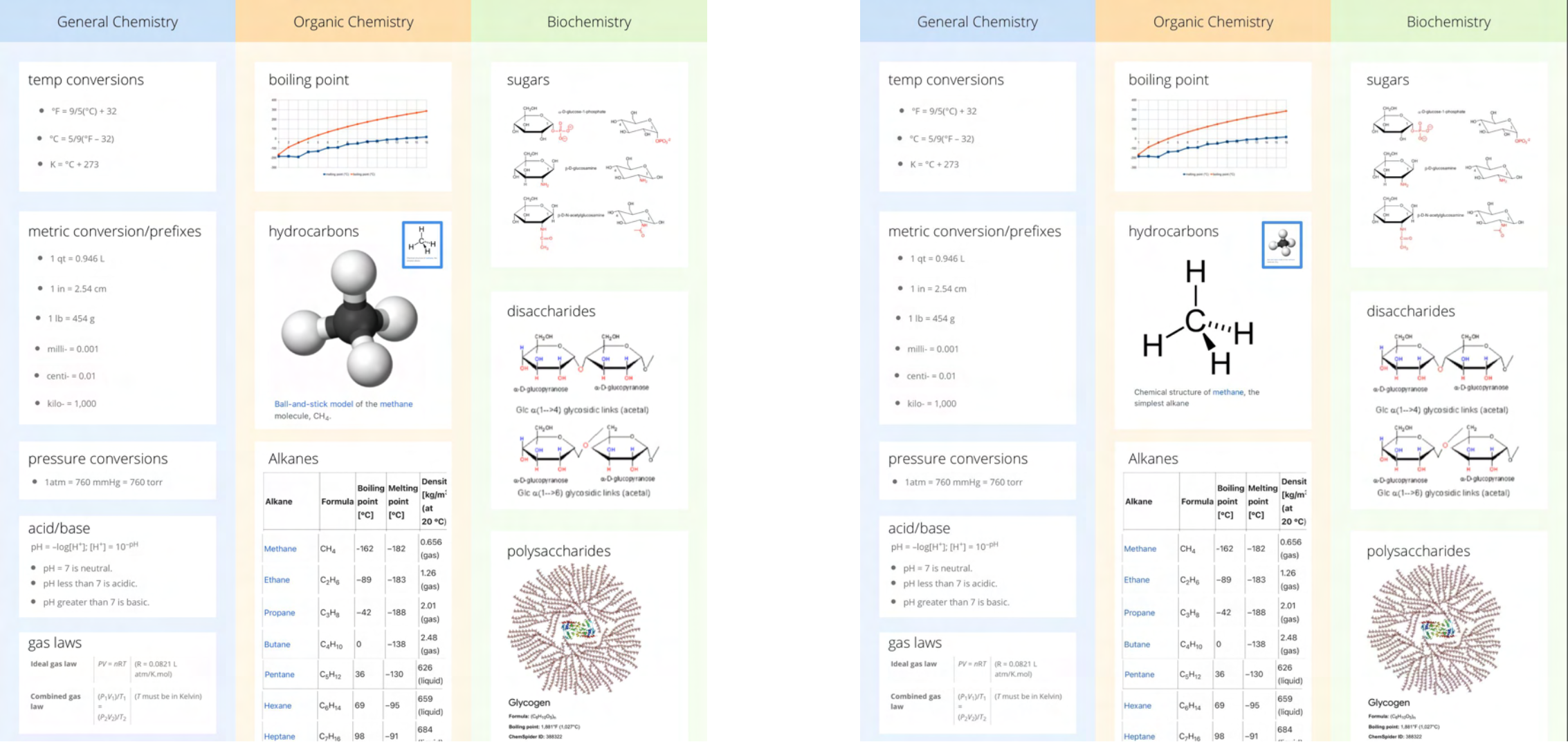 Learner clicks on the chemical molecule to see a different view..
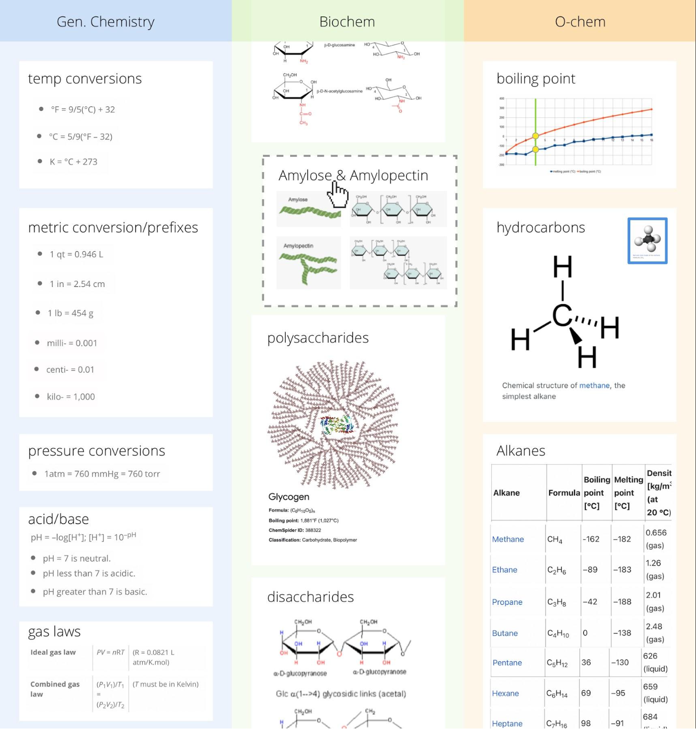 Learner can drag and drop to rearrange, add or remove components of the cheatsheet.